In this exercise, we'll work with Excel's charting/graphing
capabilities by extending your work from Part
A.
Creating a Pie Chart
Begin by opening your check book workbook from Part
A. Now, create a pie chart that shows the distribution of your
expenses as shown in this sample pie chart.
To create this pie chart:
- Select the cell range to chart. Select the
cell range of the chart,
B16:C21 in the example.
- Create the chart. Choose the "Insert" tab on
the ribbon and select the "pie" chart type from the options.
- Specify the chart settings. Work through the
chart options in the Office Ribbon (and some clever right-clicks on
the chart itself) to specify settings that will make the chart look
as much like the sample as possible:
- Display the category names around the chart (not in a
legend)
- Include the percentage values.
- Include a title.
- Put the chart on an appropriately labeled
sheet. Select the chart, and then cut and paste it to another sheet.
Don't forget to rename the sheet.
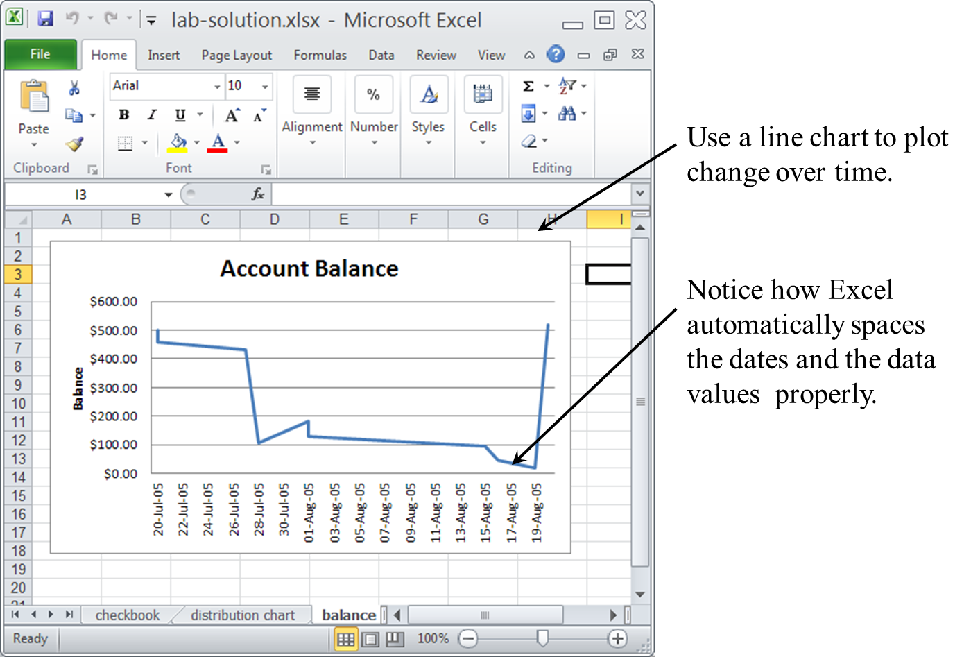
Creating a Line Chart
Also create a line chart that shows the balance of your account over
time, as shown in this sample line chart.
Create this chart as follows:
- Select the Data to Plot. Select the cells
containing the data and the dates you want to plot. Because these
cell ranges are on different parts of the chart, you must first
select the range of cells with the dates (
B3:B13 in the
example), and then press and hold the Ctrl button to
select the range of cells with the balance value (F3:F13
in the example). This will result in a more complex cell range
specification (B3:B13,F3:F13 in the example).
- Create the chart. Choose "Insert" tab and
choose a "line" chart, and then follow the wizard through the process
of creating the chart (as you did with the pie chart above).
- As with the pie chart, put this line chart
on an appropriately labeled sheet. Select the chart, and then cut
and paste it to another sheet.
To submit your solutions (to part A and B) upload your Excel Workbook
(with all three sheets) to Moodle.
We will grade this portion of the assignment according to the following
criteria:
- 50% - Pie Chart
- 10% - Appropriately title chart
- 15% - Display category names around chart
- 15% - Include percentage values
- 10% - Chart appears in separate spreadsheet
- 50% - Line Chart
- 10% - Appropriately title chart
- 20% - Label y-axis as "Balance", and include dollar signs on
y-axis markings
- 10% - Format the x-axis markings in DD-Mon-YY format
- 10% - Chart appears in separate spreadsheet