2 Visualization
We start with visualization because, well, you can see the results.
2.1 Reading
To design good visuals, you need both whys and hows. You may have come here for the hows, but both are important. Our tools are changing more rapidly than ever, so if we want knowledge that lasts, we really need to know the why.
2.1.1 Why
Read Look at Data from Healy “Data Visualization”.
The text is wordy but well organized, so your speed reading skills should work well. Look at the examples: can you explain to someone else what those examples show?
2.1.2 How
Read Data Visualization from ModernDive.
Try to actually answer the “Learning Check” questions for yourself. Yes this takes longer than just skimming right past them. But they may show up on a quiz…
2.2 References
2.2.1 Visualization Design
- A quick guide: the Graphics Principles cheat sheet.
- Fundamentals of Data Visualization
- DataWrapper’s blog has some great advice on Area charts, colors, and maps.
- https://socviz.co/
2.2.2 Implementation
- the ggplot2 book
- the R Graph Gallery
2.3 Tweaks
2.3.1 Reordering bars in a bar plot
Use fct_reorder on the categorical variable.
starwars %>%
  drop_na(height) %>%
  ggplot(aes(x = height, y = species)) +
  geom_boxplot()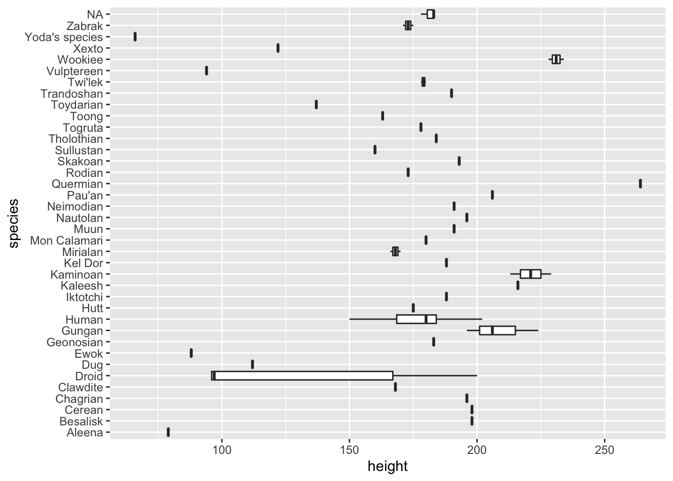
starwars %>%
  drop_na(height) %>%
  ggplot(aes(x = height, y = fct_reorder(species, height))) +
  geom_boxplot()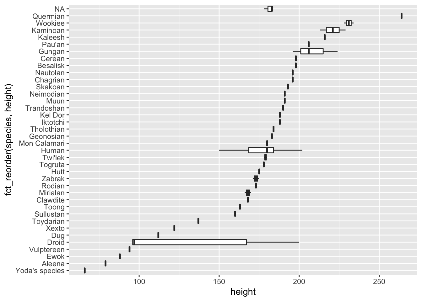
starwars %>%
  drop_na(height) %>%
  ggplot(aes(x = height, y = fct_reorder(species, height, .fun = max))) +
  geom_boxplot()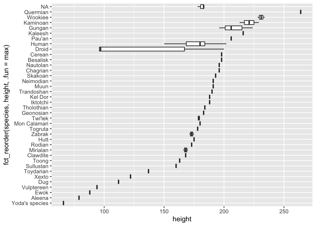
For more info, see the forcats vignette.
2.3.2 Tweaking scales
A common request: scientific notation vs not. A few options:
- Use different units. e.g., millions of people.
gapminder::gapminder %>%
  filter(country == "United States") %>%
  ggplot(aes(x = year, y = pop / 1e6)) +
  geom_line() +
  labs(y = "Population (millions)")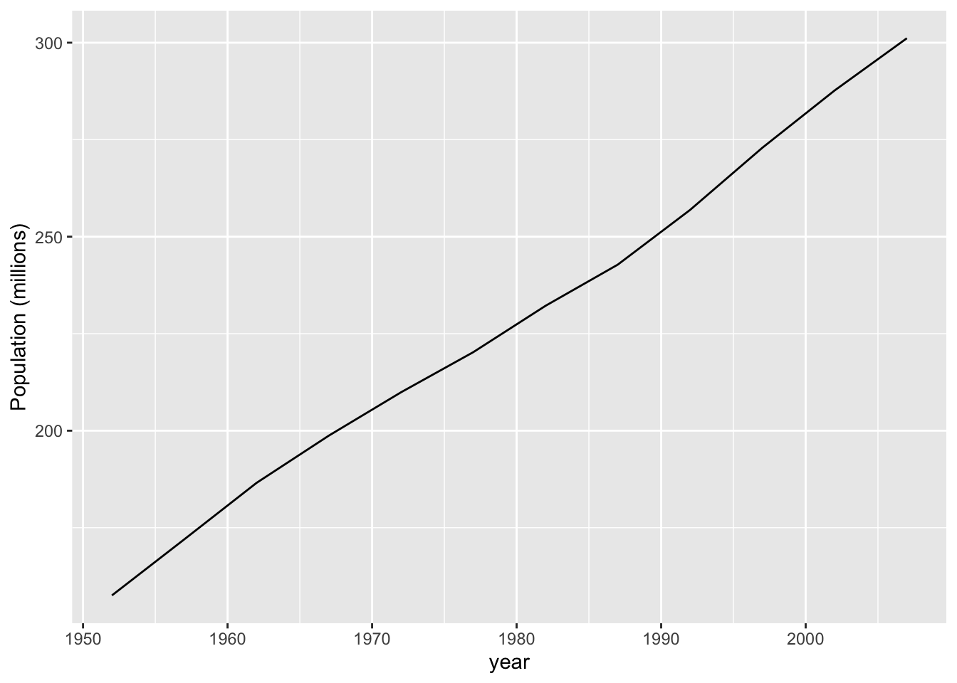
- Use
scale_y_continuouswithlabels = scales::comma.
gapminder::gapminder %>%
  filter(country == "United States") %>%
  ggplot(aes(x = year, y = pop)) +
  geom_line() +
  scale_y_continuous(labels = scales::comma) +
  labs(y = "Population")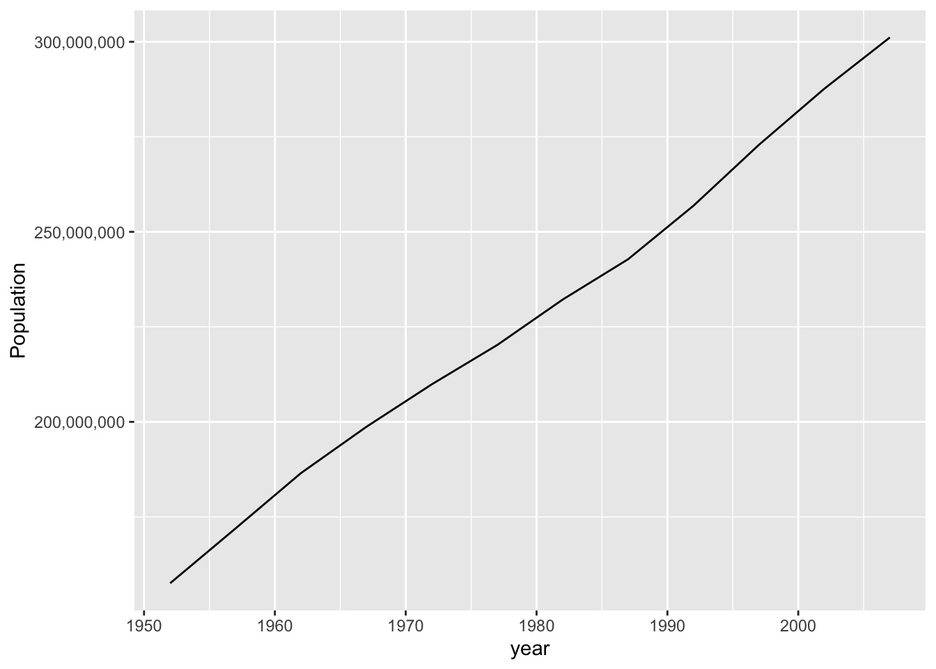
- Use
scales::label_numberfor even more control (see the help page).
gapminder::gapminder %>%
  filter(country == "United States") %>%
  ggplot(aes(x = year, y = pop)) +
  geom_line() +
  scale_y_continuous(labels = scales::label_number(scale = 1e-6, suffix = "M")) +
  labs(y = "Population")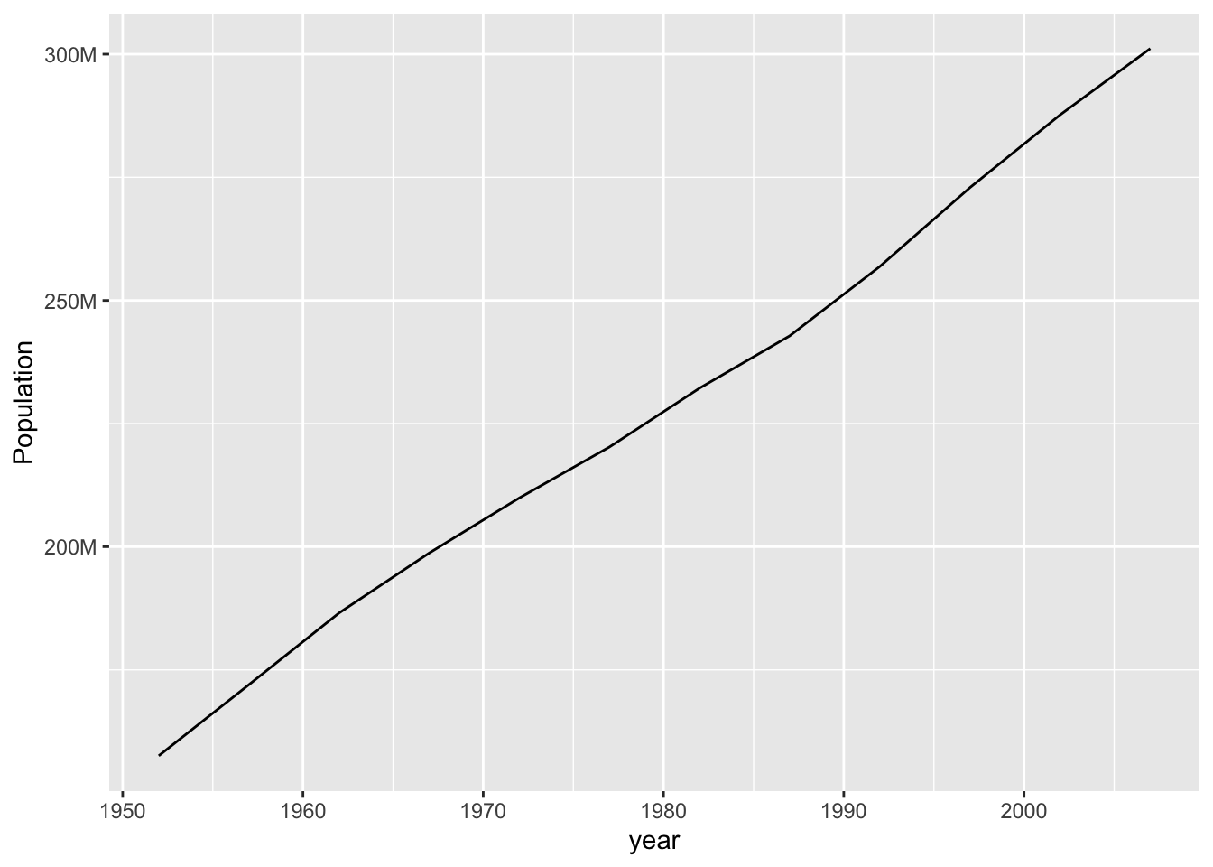
2.3.3 Direct Labels
When you have many lines, colors don’t work well for labels. Instead, use two tricks:
- Create a data frame with just the rightmost point of each line:
gapminder_filtered <-
  gapminder::gapminder %>%
  group_by(country) %>%
  filter(max(pop) > 100000000)

last_pop <- gapminder_filtered %>%
  group_by(country) %>%
slice_tail(n = 1)- Use text geoms to label those points:
gapminder_filtered %>%
  ggplot(aes(x = year, y = pop, color = country)) +
  geom_line() +
  geom_text(
    data = last_pop, aes(label = country), # use different data
    color = "black", hjust = "left" # text starts at "x" and faces right
  ) +
  scale_x_continuous(expand = expansion(mult = c(0, .2))) + # make some room
  scale_y_log10() +
  theme(legend.position = "none") # turn off legend since it's redundant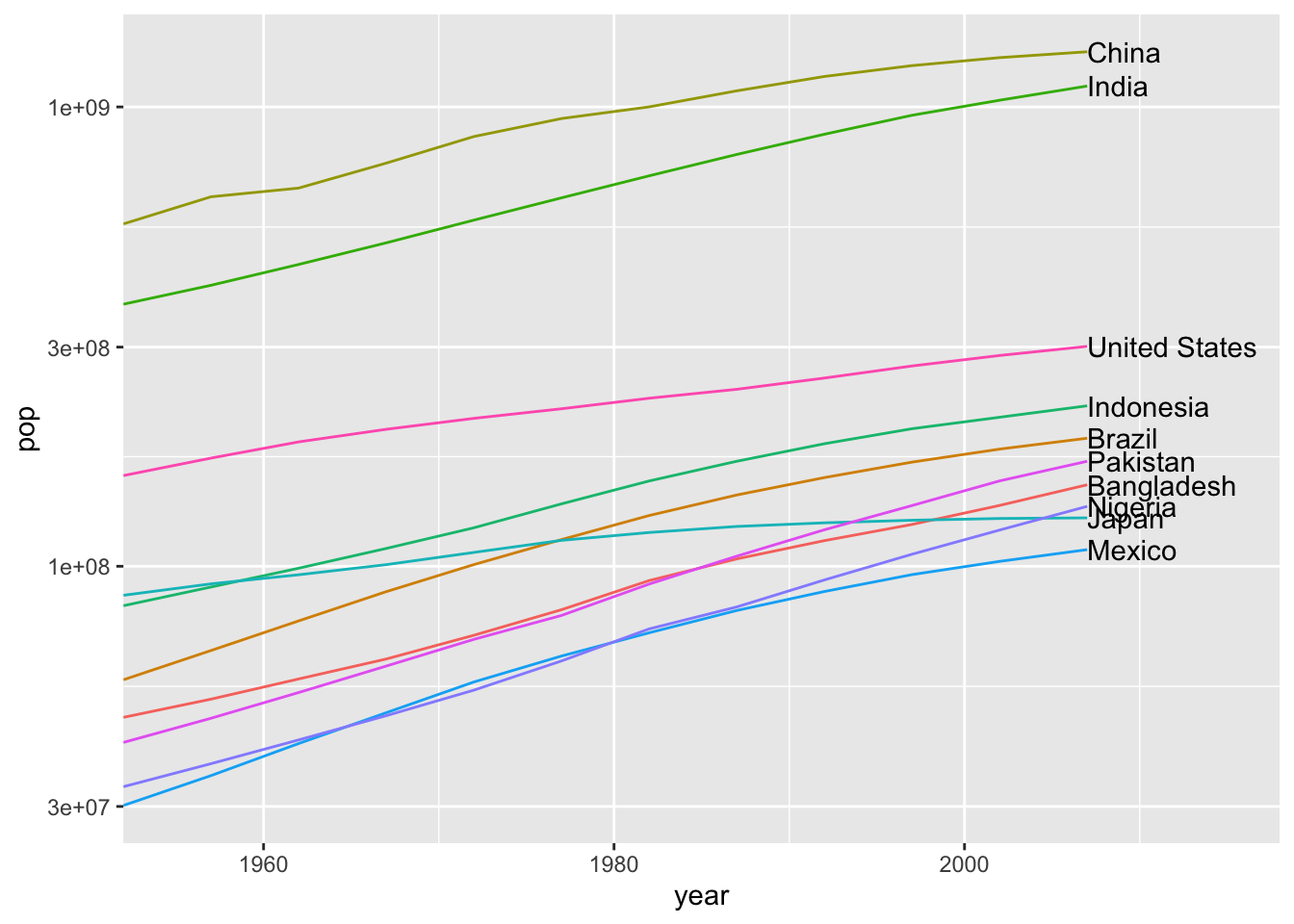
- Use
ggrepel::geom_text_repelto keep them from running into each other:
gapminder_filtered %>%
  ggplot(aes(x = year, y = pop, color = country)) +
  geom_line() +
  ggrepel::geom_text_repel(
    data = last_pop, aes(label = country),
    color = "black", hjust = "left",
    direction = "y", # only move up or down, never left/right
    segment.alpha = .1, # lighten the connecting lines
    nudge_x = 3,
    seed = 0 # make this plot reproducible.
  ) +
  scale_x_continuous(expand = expansion(mult = c(0, .3))) +
  scale_y_log10() +
  theme(legend.position = "none")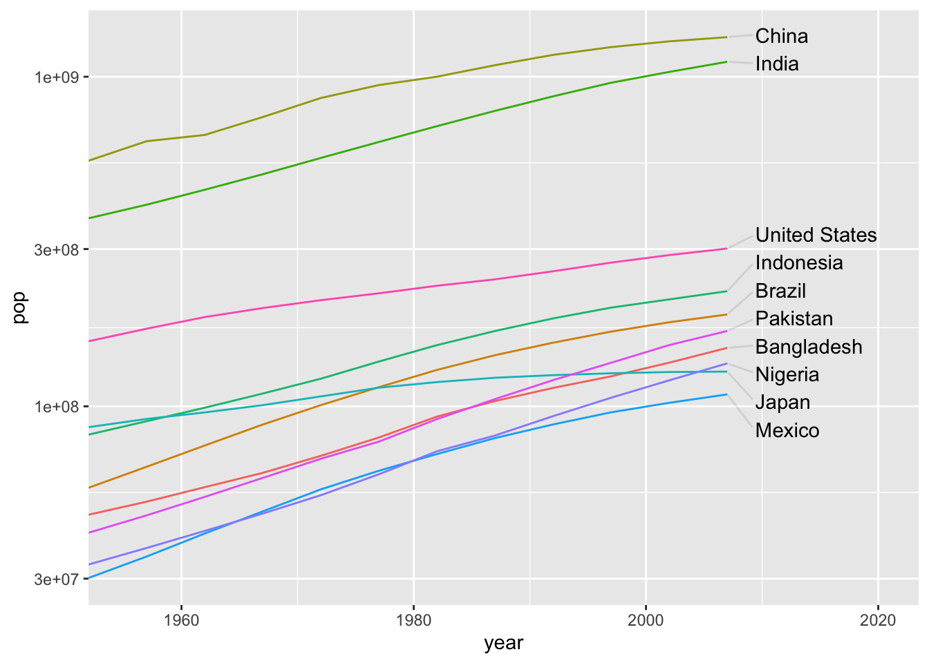
2.3.4 Legends and Labels
If you need multiple rows for your legend, you probably have too many different values. But you can grit your teeth and do it…
starwars %>% skimr::skim()| Name | Piped data |
| Number of rows | 87 |
| Number of columns | 14 |
| _______________________ | |
| Column type frequency: | |
| character | 8 |
| list | 3 |
| numeric | 3 |
| ________________________ | |
| Group variables | None |
Variable type: character
| skim_variable | n_missing | complete_rate | min | max | empty | n_unique | whitespace |
|---|---|---|---|---|---|---|---|
| name | 0 | 1.00 | 3 | 21 | 0 | 87 | 0 |
| hair_color | 5 | 0.94 | 4 | 13 | 0 | 12 | 0 |
| skin_color | 0 | 1.00 | 3 | 19 | 0 | 31 | 0 |
| eye_color | 0 | 1.00 | 3 | 13 | 0 | 15 | 0 |
| sex | 4 | 0.95 | 4 | 14 | 0 | 4 | 0 |
| gender | 4 | 0.95 | 8 | 9 | 0 | 2 | 0 |
| homeworld | 10 | 0.89 | 4 | 14 | 0 | 48 | 0 |
| species | 4 | 0.95 | 3 | 14 | 0 | 37 | 0 |
Variable type: list
| skim_variable | n_missing | complete_rate | n_unique | min_length | max_length |
|---|---|---|---|---|---|
| films | 0 | 1 | 24 | 1 | 7 |
| vehicles | 0 | 1 | 11 | 0 | 2 |
| starships | 0 | 1 | 17 | 0 | 5 |
Variable type: numeric
| skim_variable | n_missing | complete_rate | mean | sd | p0 | p25 | p50 | p75 | p100 | hist |
|---|---|---|---|---|---|---|---|---|---|---|
| height | 6 | 0.93 | 174.36 | 34.77 | 66 | 167.0 | 180 | 191.0 | 264 | ▁▁▇▅▁ |
| mass | 28 | 0.68 | 97.31 | 169.46 | 15 | 55.6 | 79 | 84.5 | 1358 | ▇▁▁▁▁ |
| birth_year | 44 | 0.49 | 87.57 | 154.69 | 8 | 35.0 | 52 | 72.0 | 896 | ▇▁▁▁▁ |
starwars %>% ggplot(aes(x = height, y = mass, color = species)) +
  geom_point() +
  theme(
    legend.position = "bottom",
    legend.key.size = unit(0.3, "cm")
#    legend.box.margin = margin(t = 0, r = 0, b = 0, l = 0, unit = "pt")
    ) +
  guides(fill = guide_legend(nrow = 2, byrow = TRUE))
## Warning: Removed 28 rows containing missing values (geom_point).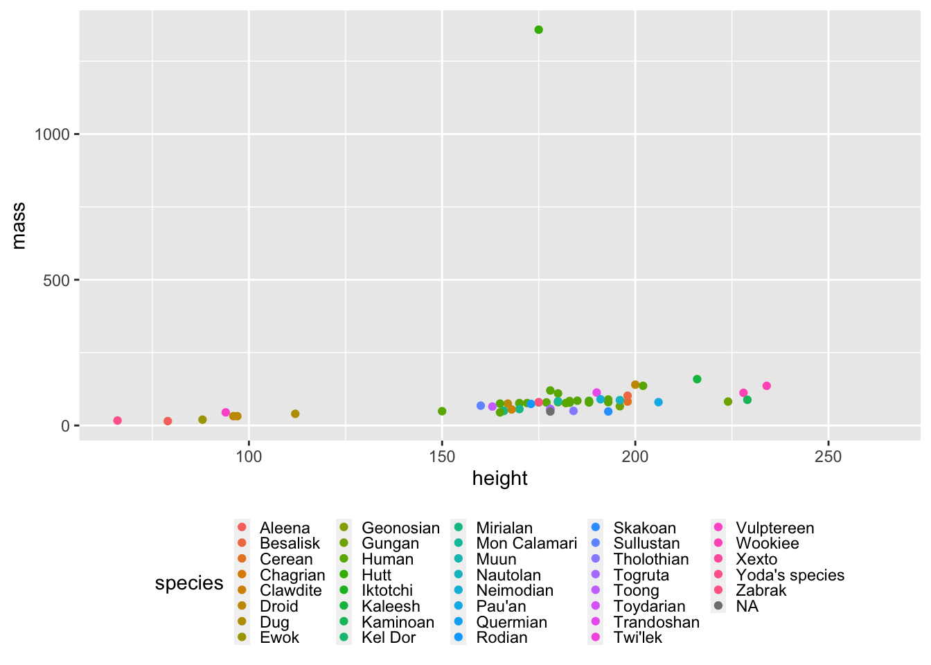
2.4 Mapping
2.4.1 Plotly
This document shows examples of two simple mapping tasks using Plotly. More details are available in the plotly-r book.
We’ll be using the tidyverse and the plotly package.
library(tidyverse)
library(plotly)
2.4.1.1 Markers
When you just want to mark something on a map, you can give lat/long coordinates to add_markers.
For example, let’s use a dataset of US cities:
maps::us.cities %>% head()## name country.etc pop lat long capital
## 1 Abilene TX TX 113888 32.45 -99.74 0
## 2 Akron OH OH 206634 41.08 -81.52 0
## 3 Alameda CA CA 70069 37.77 -122.26 0
## 4 Albany GA GA 75510 31.58 -84.18 0
## 5 Albany NY NY 93576 42.67 -73.80 2
## 6 Albany OR OR 45535 44.62 -123.09 0Here’s how to draw it on a map.
maps::us.cities %>%
  # Fix the column names.
  rename(state = country.etc) %>%
  # Keep only larger cities.
  filter(pop > 100000) %>%
  # Construct the "geo" projection.
  plot_geo() %>%
  # Add state markers
  add_markers(
    # Set marker position.
    x = ~long,
    y = ~lat,
    # Set other aesthetics (here, redundantly encode population)
    size = ~pop,
    color = ~pop,
    # Customize the label.
    text = ~ glue::glue("{name}, population {scales::comma(pop)}"),
    hoverinfo = "text"
  ) %>%
  layout(
    # Zoom into just USA.
    geo = list(
      scope = 'usa'
    )
  )
## Warning: `line.width` does not currently support multiple values.2.4.1.2 Choropleths
Plotly has builtin support for countries and US states. Any other granularity requires manually working with GeoJSON files; see the documentation.
Let’s make a world population map. First, let’s construct a dataset of the most recent data that Gapminder has for each country:
library(gapminder)
latest_country_data <- gapminder::gapminder_unfiltered %>%
  arrange(year) %>%
  group_by(country) %>%
  slice_tail(n = 1) %>%
  left_join(gapminder::country_codes, by = "country")
Now we add a “choropleth” trace. Note that this has the typical problem of choropleth maps and densities; see Fundamentals of Data Visualization for some discussion of this.
latest_country_data %>%
  plot_geo() %>%
  add_trace(
    type = "choropleth",
    # Specify that the "country" column contains the country names.
    locations = ~country,
    locationmode = "country names",
    # Use fill to show population. (I don't know why it's called 'z' and not 'fill'.)
    z = ~pop
  )