knitr::opts_chunk$set(echo = TRUE)
library(tidyverse)
library(tidymodels)
library(rpart.plot)
theme_set(theme_bw())Predictive Analytics Homework 3: Prediction with Tree-Based Models
Goals
- Compare and contrast linear regression, decision trees, and tree ensembles (random forest and boosted trees)
- Use visualization to understand the strengths and weaknesses of different models
- Identify distribution shift (bonus)
- Apply predictive modeling using
tidymodelsto a time-series prediction task
The Data
Let’s imagine we’re hired by the administrators of the Capital Bikeshare program program in Washington D.C., to help them understand and predict the hourly demand for rental bikes. We will be working with this data in several activities throughout this semester.
This understanding will help them plan the number of bikes that need to be available at different parts of the system at different times, to avoid the case where someone wants a bike but the station is empty, or someone wants to return a bike but the station is full.
The data for this problem were collected from the Capital Bikeshare program over the course of two years (2011 and 2012). Researchers at the University of Porto processed the data and augmented it with extra information, as described on this page. It has been cleaned up slightly for this assignment.
Getting Started
I used the following setup chunk when producing this assignment:
Include the following code to load the data file.
daily_rides <- readRDS(url("https://cs.calvin.edu/courses/info/602/06ensembles/hw/bikeshare-day.rds"))Explore the data file in RStudio to get familiar with what data it contains. Refer to the description above for details.
Exploratory Analytics
Optional Exercise: Make a scatter plot of the number of casual riders by date, color-coding whether each day is a workingday or not. Describe one thing you notice about the data from this plot.

Optional Exercise: When starting an analysis, it’s really useful to look at the distribution of your response variable. Plot the distribution of casual. Use a histogram or density plot.

Notice the long tail of high-ridership days. These can often throw off a model. Also notice that there are no ride counts below 0, as should be expected for data of counts. But a linear model might end up predicting a negative value, which wouldn’t make sense.
We can address both of those problems by transforming our response variable. Instead of trying to predict casual, let’s try to predict log(casual). That way we’ll never predict a negative value for casual.
Other transformations may work better, but log-transforming data is simple and common. In a linear model, it means that each term contributes multiplicatively to the prediction: each degree of temperature increase will mulitply the ride count by something (i.e., it goes up by x percent), rather than adding to it.
log(casual) and ggpairs
You don’t need to do this now, but you might want to try it later.
Optional Exercise: Now, plot the distribution of log(casual). Use a histogram or density plot.
```{r log-casual-hist}
daily_rides %>%
  ggplot(aes(x = log(casual))) + geom_histogram(binwidth = .25)
```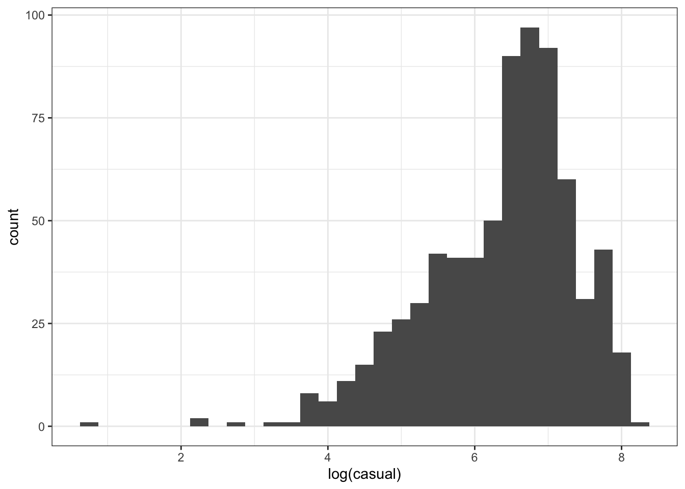
Notice that the data distribution is less skewed, and the clear outliers are now actually the low-ridership days, which may not matter as much anyway.
For your first time through this assignment, use casual without transformation. Once you finish, optionally try going back and predicting log(casual) instead.
One final useful bit of EDA: ggpairs. Try this on your own. You may need to adjust the figure size to make it big enough. You can always reduce the number of variables you’re plotting. If you have trouble getting an appropriate output, comment this out.
daily_rides %>%
  select(month, workingday, temp, atemp, casual) %>%
  GGally::ggpairs()
Train-test split
We’re going to do two kinds of train-test split for this assignment.
First, we’re going to pretend that this isn’t a time series prediction task. That is, we’ll ignore the progression of time, considering each day independently. This is the classic setting of supervised learning, and we’ll see how well our models learn to predict this data and generalize to other randomly selected days.
Then, we’ll recognize that the pattern of bike ridership actually does change over time; the phenomenon is called distribution shift. Specifically, we’ll compare 2011 (the first full year of service for which we have data) and 2012 (the second full year).
So we’ll start by splitting the data by year:
rides_2011 <- daily_rides %>% filter(year == 2011)
rides_2012 <- daily_rides %>% filter(year == 2012)
Check that you get 365 days in 2011 and 366 days in 2012 (why might this make sense?)
Now we’ll do a train-test split on 2011. We’ll hold out 2012 as a real testing set and return to it later.
set.seed(1234)
rides_split <- initial_split(rides_2011, prop = 3/4)
train <- training(rides_split)
test <- testing(rides_split)
We’ll want to analyze performance by whether a day is in the training or test set. So we’ll combine them back together to make a data frame we can predict on later. Notice that the result has a split column, which will record whether each row came from the training or test set.
rides_2011_with_split_marked <- bind_rows(
  train = train,
  test = test,
  .id = "split"
) %>% mutate(split = as_factor(split)) %>%
  arrange(date)
rides_2011_with_split_marked %>% head() %>% knitr::kable()| split | date | year | workingday | temp | atemp | casual | registered | month | day_since_start |
|---|---|---|---|---|---|---|---|---|---|
| test | 2011-01-01 | 2011 | weekend | 8.175849 | 7.999250 | 331 | 654 | 1 | 1 |
| train | 2011-01-02 | 2011 | weekend | 9.083466 | 7.346774 | 131 | 670 | 1 | 2 |
| test | 2011-01-03 | 2011 | workday | 1.229108 | -3.499270 | 120 | 1229 | 1 | 3 |
| train | 2011-01-04 | 2011 | workday | 1.400000 | -1.999948 | 108 | 1454 | 1 | 4 |
| test | 2011-01-05 | 2011 | workday | 2.666979 | -0.868180 | 82 | 1518 | 1 | 5 |
| train | 2011-01-06 | 2011 | workday | 1.604356 | -0.608206 | 88 | 1518 | 1 | 6 |
This is actually a time series prediction problem, sometimes just called forecasting. Methods that are competitive for forecasting almost always look at recent history, not just general trends. There are ways of adapting the models we use here to do that, but we will keep it simple for now.
One aspect of time series prediction bears noting here, though: we need to be mindful of how we evaluate performance. If we picked days at random to evaluate on, most of the evaluation days would be within the time we’ve already seen. So we would be overconfident in our model’s ability to predict future ridership.
The initial_time_split function can be used for this purpose if there is not a nice division by year like we have here.
More discussion of time series validation approaches can be found here.
Fitting Models
We’re going to compare four different models for predicting this data:
- Linear regression
- Decision tree
- Random Forest
- XGBoost
To keep the comparison simple (though not necessarily fair), we’ll use the same prediction formula for all four models:
model_formula <- casual ~ temp + workingday + month
# Come back and try this one later:
# model_formula <- casual ~ temp + workingday + month + day_since_start
Linear Regression
First we’ll fit a linear regression:
linreg_model <- fit(
  linear_reg(),
  model_formula,
  data = train
)
Exercise 1 (1pt): Inspect the model (using tidy() or otherwise). Complete this sentence: “For every additional degree C, the model predicts ___ additional rides.”
```{r include=TRUE}
linreg_model %>%
  tidy() %>%
  select(term, estimate)
```
# A tibble: 14 × 2
term estimate
<chr> <dbl>
1 (Intercept) 490.
2 temp 24.2
3 workingdayworkday -636.
4 month2 43.4
5 month3 219.
6 month4 336.
7 month5 497.
8 month6 405.
9 month7 493.
10 month8 297.
11 month9 320.
12 month10 373.
13 month11 187.
14 month12 43.8Predictions
Let’s plot the model’s predictions on the training set along with the number of casual rides. Do this by using augment(linreg_model, train) to make the predictions, then plot the result. You’ll want to add a geom_line where you specify .pred as the y aesthetic.
augment(linreg_model, train) %>%
  ggplot(aes(x = date, y = casual, color = workingday)) +
  geom_point() +
  geom_line(aes(y = .pred))
Exercise 2 (2pt): This is a linear model, so generally we expect to see straight lines. Explain why the prediction is not a straight line. Hint: Think about what the x axis shows here, vs what x axis would show a straight line. (To check your reasoning, try temporarily changing your formula. You might try casual ~ temp.)
Observed by Predicted
Let’s make an observed-by-predicted plot. Add coord_obs_pred() to make the axes exactly equal, and geom_abline to draw the line corresponding to exactly correct predictions. Use the training set again.
augment(linreg_model, new_data = train) %>%
  ggplot(aes(x = casual, y = .pred, color = workingday)) +
  geom_abline() +
  geom_point(alpha = .5) +
  coord_obs_pred()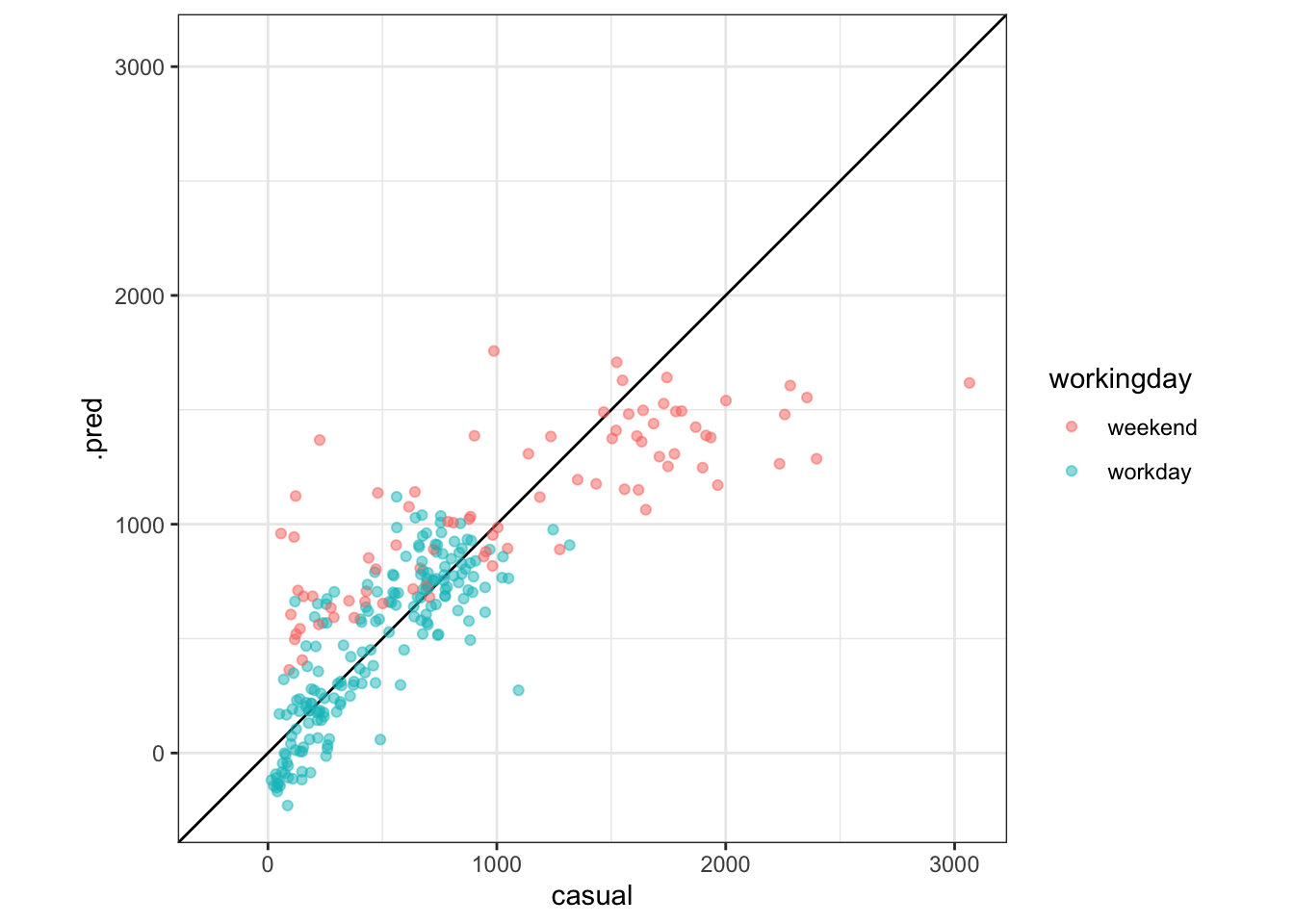
Exercise 3 (1pt): Under what circumstances does this this model typically predict too high? Under what circumstances does it predict too low? Use the plots above to justify your answer.
Model debugging strategy:
- What values do the features have when the prediction is wrong? (only one feature is shown in that plot, but you could imagine making other plots.)
- What value does the target have when the prediction is wrong?
Quantify errors
Use the mae function (or write your own summarize call) to compute the Mean Absolute Error for both the train and test sets.
augment(linreg_model, rides_2011_with_split_marked) %>%
  group_by(split) %>%
  #summarize(mae = mean(abs(casual - .pred)))
  mae(truth = casual, estimate = .pred)
# A tibble: 2 × 4
split .metric .estimator .estimate
<fct> <chr> <chr> <dbl>
1 train mae standard 220.
2 test mae standard 235.Exercise 4 (1pt): Complete the following sentence using the appropriate result from the table above: “On days that the model had not seen, the predicted number of rides was _____”. (You will need to use several words to fill in the blank.)
Decision Tree Regression
Now, let’s fit a decision tree using the same model_formula as the linear regression. Use the default settings. Call the result dtree_model.
dtree_model <- fit(
  decision_tree(mode = "regression"),
  model_formula, data = train)
We can show the tree using the same method we used in class and lab:
dtree_model %>%
  extract_fit_engine() %>%
  rpart.plot(roundint = FALSE, digits = 3, type = 4)
Exercise 5 (1pt): Select an arbitrary day from the dataset. Using the tree diagram shown here (which may differ slightly from what you obtain if you run the same code), explain how the model makes its prediction about the casual ridership on that date.
Exercise 6 (2pt): We’ve made another observed-by-predicted plot, this time for the decision tree. Explain why the horizontal lines appear for this model and not the linear regression model.
augment(dtree_model, new_data = train) %>%
  ggplot(aes(x = casual, y = .pred, color = workingday)) +
  geom_abline() +
  geom_point(alpha = .5) +
  coord_obs_pred()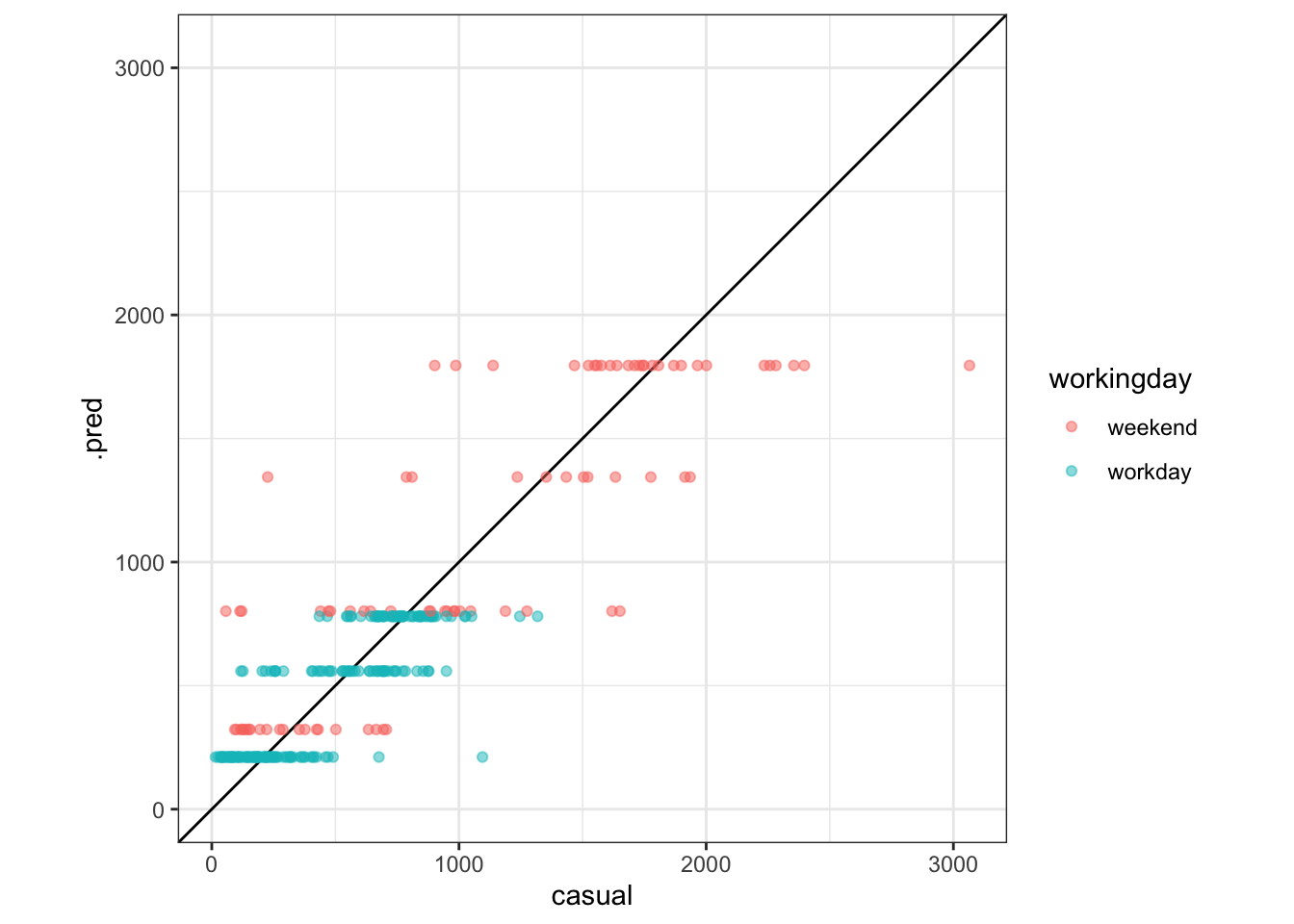
Exercise 7 (1pt): Write a succinct sentence comparing the quantitative performance of this model with the performance of the linear regression model. You’ll need the results below:
```{r include=TRUE}
augment(dtree_model, rides_2011_with_split_marked) %>%
  group_by(split) %>%
  #summarize(mae = mean(abs(casual - .pred)))
  mae(truth = casual, estimate = .pred)
```
# A tibble: 2 × 4
split .metric .estimator .estimate
<fct> <chr> <chr> <dbl>
1 train mae standard 180.
2 test mae standard 186.Ensembles
Finally, let’s fit Random Forest (rand_forest) and gradient-boosted tree (boost_tree) regression models on this data. Call them rf_model and boost_model.
rf_model <-
  rand_forest(mode = "regression") %>%
  fit(model_formula, data = train)
boost_model <- fit(
  boost_tree(mode = "regression"),
  model_formula, data = train)
We can’t show these models because they have too many different trees in them. But we can still make other plots. Make observed-by-predicted plots for both the rf_model and the boost_model. (If you know how to write functions, this could be a good place to use them!)
Exercise 8 (1pt): What do you notice about the boosted tree that was not true for any of the other models?
augment(rf_model, new_data = train) %>%
  ggplot(aes(x = casual, y = .pred, color = workingday)) +
  geom_abline() +
  geom_point(alpha = .5) +
  coord_obs_pred()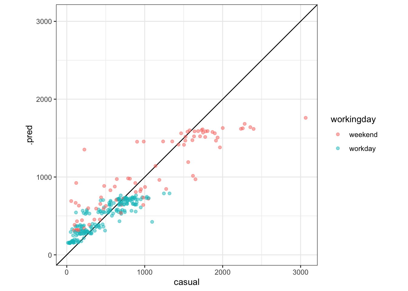
augment(boost_model, new_data = train) %>%
  ggplot(aes(x = casual, y = .pred, color = workingday)) +
  geom_abline() +
  geom_point(alpha = .5) +
  coord_obs_pred()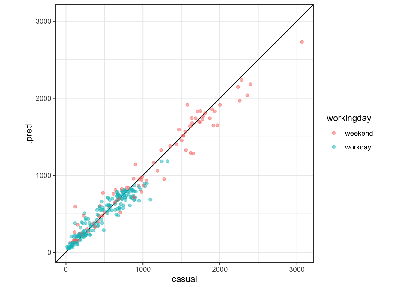
# As an aside, here's a way to use a function to represent what's in common between these plots.
# It uses an advanced tidyverse technique: https://dplyr.tidyverse.org/articles/programming.html#indirection
show_obs_vs_pred <- function(model, data, var, ...) {
  augment(model, new_data = data) %>%
    ggplot(aes(x = {{var}}, y = .pred, ...)) +
    geom_abline() +
    geom_point(alpha = .5) +
    coord_obs_pred()
}
show_obs_vs_pred(rf_model, train, casual, color = workingday)
show_obs_vs_pred(boost_model, train, casual, color = workingday)
Finally, let’s quantify the performance of all these models. Here’s a relatively simple way to combine the results of all models:
eval_dataset <- rides_2011_with_split_marked

all_predictions <- bind_rows(
  linreg_model = augment(linreg_model, new_data = eval_dataset),
  dtree_model = augment(dtree_model, new_data = eval_dataset),
  rf_model = augment(rf_model, new_data = eval_dataset),
  boost_model = augment(boost_model, eval_dataset),
  .id = "model"
) %>% mutate(model = as_factor(model))
Now we can group by model and split to compute our metrics:
all_predictions %>%
  group_by(model, split) %>%
  mae(truth = casual, estimate = .pred) %>%
  mutate(mae = .estimate) %>%
  ggplot(aes(x = model, y = mae, fill = split)) +
    geom_col(position = "dodge")
Exercise 9 (2pt): Summarize the relative performance of these different models. Which performs best on training set data? Which performs best on unseen data? We say that a model underfits when it performs poorly even on its training data, and that a model overfits when its training-set performance stops being a good indicator of its test set performance. Which model(s) underfit? Which model(s) significantly overfit?
Distribution Shift
The goal of this last section is to notice what happens when the data and task break one of the basic assumptions of supervised learning. The models we’re using are trained to try to capture (i.e., “model”) the distribution of data that they were trained on. When tested on more data of the same kind, they tend to do well (to different degrees depending on the data). But when tested on data that came from a different distribution, they might do much worse. This scenario is called distribution shift, because the distribution of the data has changed compared with the data that the model was trained on. Sometimes the more closely the model captures its training distribution, the less robust it is to distribution shift.
Our scenario includes an example of distribution shift: the second full year of operation (2012), ridership patterns were significantly different than they were on comparable days in 2011. In this case, the distribution has shifted for the next year (2012), so some of what we learned in 2011 no longer applied. Think about how learning to fit one distribution better may have come at the expense of robustness to distribution shifts.
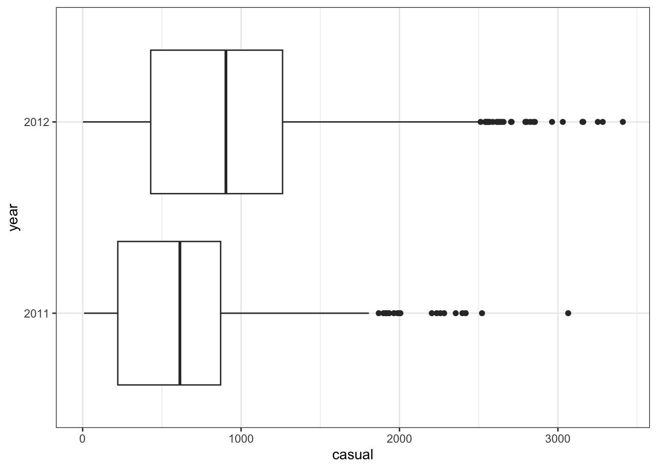
Exercise 10 (1pt): Refer to our exploratory plot from the very first exercise. What difference(s) do you notice about the distribution of daily rides in 2011 vs 2012?
```{r casual-by-year-boxplot, include=TRUE}
daily_rides %>% ggplot(aes(x = casual, y = year)) + geom_boxplot()
```
The code below repeats the same code we used to compare the models on the 2011 data, but this time compares 2011 and 2012.
eval_dataset <- daily_rides %>%
  mutate(split = year)

all_predictions <- bind_rows(
  linreg_model = augment(linreg_model, new_data = eval_dataset),
  dtree_model = augment(dtree_model, new_data = eval_dataset),
  rf_model = augment(rf_model, new_data = eval_dataset),
  boost_model = augment(boost_model, eval_dataset),
  .id = "model"
) %>% mutate(model = as_factor(model))
all_predictions %>%
group_by(model, split) %>%
mae(truth = casual, estimate = .pred) %>%
mutate(mae = .estimate) %>%
ggplot(aes(x = model, y = mae, fill = split)) +
geom_col(position = "dodge")
Exercise 11 (1pt): Suppose you had actually deployed one of these models (which? why?) at the beginning of 2012, trained on 2011 data, for some business purpose. As the year progresses, your boss notices that the model has more error than you had initially said it would, and asks you why. Explain why, without using the word “distribution”.
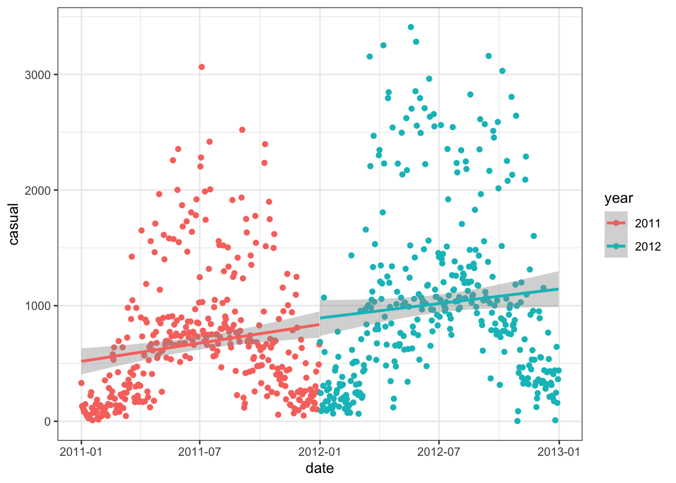
The following plot may also be insightful:
```{r casual-by-date-trend, message=FALSE}
daily_rides %>% ggplot(aes(x = date, y = casual, color=year)) + geom_point() + geom_smooth(method = 'lm')
```
Submit
Follow the same instructions as for the previous homework.
This assignment is worth 14 points total.