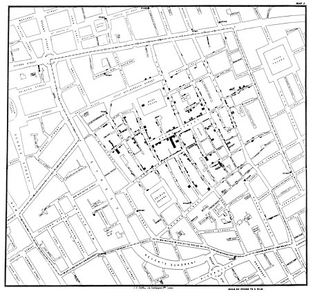
class: left, top, title-slide .title[ # Geospatial Data<br>Example: J. Snow’s Famous Map ] .author[ ### Keith VanderLinden<br>Calvin University ] --- # Snow’s Map .pull-left[ John Snow’s analysis of a mid-1800s outbreak of cholera was based on his hand-drawn, geospatially-mapped data shown here. .footnote[Image from: [Wikimedia.org](https://upload.wikimedia.org/wikipedia/commons/thumb/2/27/Snow-cholera-map-1.jpg/450px-Snow-cholera-map-1.jpg)).] ] .pull-right[  ] ??? - This is a distilled version of the textbook's demo. - References: - https://en.wikipedia.org/wiki/John_Snow#Cholera - https://mdsr-book.github.io/mdsr2e/gfx/1280px-Snow-cholera-map-1.jpg - https://archive.org/details/b28985266/page/n57/mode/2up --- # Snow’s Data .pull-left[ ```r library(tidyverse) library(mdsr) CholeraDeaths ``` ``` Id Count geometry 1 0 3 529308.7, 181031.4 2 0 2 529312.2, 181025.2 3 0 1 529314.4, 181020.3 4 0 1 529317.4, 181014.3 5 0 4 529320.7, 181007.9 6 0 2 529336.7, 181006.0 7 0 2 529290.1, 181024.4 ... ``` ```r library(sf) plot(CholeraDeaths["Count"]) ``` ] .pull-right[ <img src="snow_files/figure-html/unnamed-chunk-3-1.png" width="100%" style="display: block; margin: auto;" /> ] ??? - Compare and contrast this with Snow's original map. - You can see what appear to be street lines, but this plot doesn't have the context provided by the map (vector or raster). - The counts are indicated by color, not by repeated "bars" as in Snow's original plot. --- # A Reproduction of Snow’s Map .pull-left[ ```r library(ggspatial) dsn <- "data/SnowGIS_SHP" deaths <- st_read(dsn, layer = "Cholera_Deaths", quiet = TRUE) %>% st_set_crs(27700) %>% st_transform(4326) pumps <- st_read(dsn, layer = "Pumps", quiet = TRUE) %>% st_set_crs(27700) %>% st_transform(4326) deaths %>% ggplot() + annotation_map_tile(type="osm", zoomin=0)+ geom_sf(aes(size = Count), alpha = 0.7)+ geom_sf(data = pumps, size=3, color="red") ``` ] .pull-right[ <img src="snow_files/figure-html/unnamed-chunk-4-1.png" width="100%" style="display: block; margin: auto;" /> ] ??? - This got ugly because the original data was in a UK format (27700), not WGS84 (4326). Hence, the need to transform it before layering it over the OSM tiles. - We project the cholera data points onto the projection used by the map tile. - First, `st_set_crs()` projects onto EPSG:27700, as is suggested by the dataset. - Then, `st_transform()` projects onto EPSG:4326 (aka. WGS84), which is what we really want. - Set `quiet = FALSE` to see useful st_read() output. - Disentangle the CRS & transform required to get this projection right.