class: left, top, title-slide .title[ # Tidy Data<br>Structuring Datasets Effectively ] .author[ ### Keith VanderLinden<br>Calvin University ] --- ```r library(tidyverse) ``` # Example: WHO Health Data Table 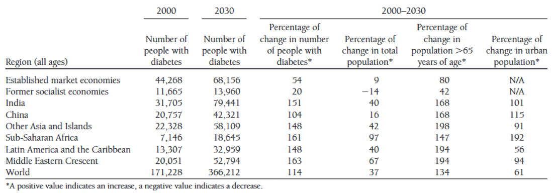 .footnote[From: Global Prevalence of Diabetes, WHO, 2004, https://www.who.int/diabetes/facts/en/diabcare0504.pdf] ??? We begin this unit with an example. - This table presents data on the incidence of diabetes over specified times and places using a format that is typical of scientific publications. - It may well be an effective *presentation* of the information, but it's not a proper *representation* for a dataset: - For this particular use case, it *aggregates*: - Rows, e.g.: 2000 vs. 2000-2030; China vs. "Other Asia and Islands" - Columns, e.g.: 2000, 2030 & 2000-2030 - It adds "rows" that aren't actual data, e.g.: the footnote, potential sub-total rows ("World"?). - And it's not hard to imagine more poorly-behaved datasets in the "wild". How is the underlying dataset from which this chart was built structured, or, more importantly, how *should* it be structured? --- # Example: Potential Dataset Structures  .footnote[Cf. *R for Data Science*, Chapter 12, https://r4ds.had.co.nz/tidy-data.html] ??? - This dataset is fabricated but illustrates how the underlying dataset for the previous example might look. - c. gives rows for distinct country-year pairs with cases & population, but: - Getting data on a country would require a join - possible but inefficient - Summing up cases for all countries would require combining columns - inefficient - Representing data from additional years would require adding additional columns - painful - b. givens rows for distinct country-year-type triples with population (count), but: - The values in the count column are dissimilar, so one would always be grouping by type. - inefficient - a. gives tables of country rows with annual columns. This looks more like the (well-behaved) datasets we've used so far. - Computation = algorithms + data structures. We've scripted algorithms using R/dplyr; now we consider the structure of proper data structures. --- # Tidy Data Happy families are all alike; every unhappy family is unhappy in its own way.<br>--- L. Tolstoy, *Anna Karenina* --- # Tidy Data ~~Happy families~~ *Tidy datasets* are all alike; every ~~unhappy family~~ *raw dataset* is ~~unhappy~~ *untidy* in its own way.<br>--- L. Tolstoy adapted by H. Wickham, *R for Data Science* -- *Tidy* datasets have the following characteristics: - Each *variable* must have its own column. - Each *observation* must have its own row. - Each *value* must have its own cell.  .footnote[See: https://r4ds.had.co.nz/tidy-data.html] ??? - The text focuses on #1 & #2; #3 is assumed but important - we can't allow list values (cf. first normal form). Notes: - Tidying a dataset can be seen as *normalization*. - tidy != neat (Alas, Marie Kondo's adage that "with cleanliness, we confront dirt; with tidiness, we confront ourselves" is not apt here.) --- # Example: The Tidy Choice *Tidy* datasets have the following characteristics: - Each *variable* must have its own column. - Each *observation* must have its own row. - Each *value* must have its own cell.  ??? - Demonstrate that structure a (above) is tidy. Mostly, it's the variables constraint that distinguishes the options. - *Values*: All three are ok here. - *Observations*: a & b are ok here, but c spreads observations across tables unnecessarily. - *Variables*: - a's columns are single variables - b$count combines variables - c's columns spread variables across columns.