class: left, top, title-slide .title[ # Visualization 1<br>Principles ] .author[ ### Keith VanderLinden<br>Calvin University ] --- # The Purpose of Data Visualization .pull-left[ ```r library(tidyverse) library(datasauRus) datasaurus_dozen ``` ``` ## # A tibble: 1,846 × 3 ## dataset x y ## <chr> <dbl> <dbl> ## 1 dino 55.4 97.2 ## 2 dino 51.5 96.0 ## 3 dino 46.2 94.5 ## 4 dino 42.8 91.4 ## 5 dino 40.8 88.3 ## 6 dino 38.7 84.9 ## 7 dino 35.6 79.9 ## 8 dino 33.1 77.6 ## 9 dino 29.0 74.5 ## 10 dino 26.2 71.4 ## # … with 1,836 more rows ``` ] ??? This dataset includes multiple observations for each of the listed datasets. It's hard to see any patterns because there are so many observations. -- .pull-right[ ```r datasaurus_dozen %>% group_by(dataset) %>% summarize(n = n()) ``` ``` ## # A tibble: 13 × 2 ## dataset n ## <chr> <int> ## 1 away 142 ## 2 bullseye 142 ## 3 circle 142 ## 4 dino 142 ## 5 dots 142 ## 6 h_lines 142 ## 7 high_lines 142 ## 8 slant_down 142 ## 9 slant_up 142 ## 10 star 142 ## 11 v_lines 142 ## 12 wide_lines 142 ## 13 x_shape 142 ``` ] ??? There 142 observations for each of 13 datasets. --- # The Purpose of Data Visualization ```r datasaurus_dozen %>% filter(dataset %in% c("away", "bullseye", "dots", "star", "dino")) %>% group_by(dataset) %>% summarize( mean_x=mean(x), mean_y=mean(y), std_dev_x=sd(x), std_dev_y= sd(y), corr_x_y=cor(x, y) ) ``` ``` ## # A tibble: 5 × 6 ## dataset mean_x mean_y std_dev_x std_dev_y corr_x_y ## <chr> <dbl> <dbl> <dbl> <dbl> <dbl> ## 1 away 54.3 47.8 16.8 26.9 -0.0641 ## 2 bullseye 54.3 47.8 16.8 26.9 -0.0686 ## 3 dino 54.3 47.8 16.8 26.9 -0.0645 ## 4 dots 54.3 47.8 16.8 26.9 -0.0603 ## 5 star 54.3 47.8 16.8 26.9 -0.0630 ``` ??? Interestingly, the means, std-deviations, and Pearson correlations are largely identical. And yet... --- # The Purpose of Data Visualization ```r datasaurus_dozen %>% filter(dataset %in% c("away", "bullseye", "dots", "star", "dino")) %>% ggplot(aes(x=x, y=y, colour=dataset)) + geom_point() + theme_void() + theme(legend.position = "none") + facet_wrap(~dataset, nrow=1) ``` 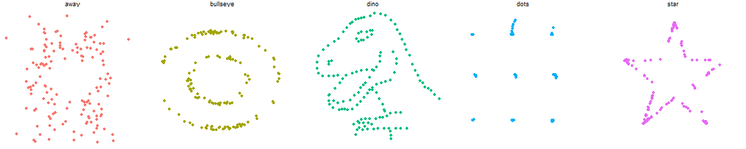<!-- --> .footnote[See: https://cran.r-project.org/web/packages/datasauRus/vignettes/Datasaurus.html] ??? Never trust summary statistics alone. Graphics can help distill *information* from *data*. “The simple graph has brought more *information* to the *data* analyst’s mind than any other device.” — John Tukey, cited in R4DS [J. Tukey’s oft-cited quote](https://r4ds.had.co.nz/data-visualisation.html) References: - http://www.thefunctionalart.com/2016/08/download-datasaurus-never-trust-summary.html - https://en.wikipedia.org/wiki/Anscombe%27s_quartet --- # The Foundations of Data Visualization *Data Visualization* uses visual representations to help data scientists discover and present patterns in data. It takes advantage of the well-developed human visual system. Designing an effective visualization requires that we determine: - The *purpose* of the visualization by identifying: - the key question - the context - The most appropriate visual *composition* using: - Principles of effective graphic design - N. Yau’s taxonomy (visual cues, coordinate systems, scale, context) These ideas are summarized in the Novartis [Graphics Principles Cheat Sheet](https://github.com/GraphicsPrinciples/CheatSheet/blob/master/NVSCheatSheet.pdf) .footnote[See: https://github.com/GraphicsPrinciples/CheatSheet/blob/master/NVSCheatSheet.pdf<br>Cf. M. Vandemeulenbroecke et al, Effective Visual Communication for the Quantitative Scientist, https://ascpt.onlinelibrary.wiley.com/doi/full/10.1002/psp4.12455] ??? - Purpose/Function/Strategy (see: *Cheatsheet "Planning"*) - Identify the key *question* (cf. Question-driven scientific inquiry) - Communicating vs Exploring - Know the *context* (e.g., audience, domain, …) - Composition/Form/Tactics - Principles of effective graphic design (for information) - Review: **Cheatsheet "Principles of Effective Graphic Design"**. - Review: **Cheatsheet "Selecting the right base graph"** (n.b., no pie charts) - Review: **Cheatsheet "Proximity improves association"**. - Yau’s taxonomy (MDSR2.2 focuses on these.) - *Visual cues*: **Cheatsheet "Effectiveness Ranking"**. - *Color*: **Cheatsheet "Color for emphasis or distinction"**. - *Coordinate system*: Cartesian; polar; geographical - *Scale*: numeric (linear/logarithmic/percentage); categorical; time - *Context*: titles/labels References: - See: [Vandemeulebroeck, Figure 1](https://ascpt.onlinelibrary.wiley.com/doi/full/10.1002/psp4.12455#psp412455-fig-0001) - See: [Vandemeulebroeck, Figure 2](https://ascpt.onlinelibrary.wiley.com/doi/full/10.1002/psp4.12455#psp412455-fig-0002) - Graphics Principles - Website: <https://graphicsprinciples.github.io> - Paper: <https://ascpt.onlinelibrary.wiley.com/doi/full/10.1002/psp4.12455> - [DSBox Visualisation Tips](https://rstudio-education.github.io/datascience-box/course-materials/slides/u2-d14-effective-dataviz/u2-d14-effective-dataviz.html) - Key researchers: J. Tukey, E. Tufte, W. Cleveland [& R. McGill] --- # Analyzing a Visualization .pull-left[ <!-- --> ] .pull-right[ - Purpose <br><br> - Question <br><br> - Context <br><br><br> - Composition <br><br> - Graphic Design <br><br> - Yau’s taxonomy ] ??? 1. Purpose: - To communicate the relationship between child health an over time across the world. - Narrowly, for his world health course; generally, for everyone 2. Composition - General principles of graphic design (see below) - N. Yau’s taxonomy - *Visual cues*: - Position (Scatter plot) shows correlation - Color (continent) & area (population) for less important data - *Coordinate system* - Cartesian (x-y) for most important numerical correlation - Categorical (color) for continent - *Scale*: numeric (logarithmic) - *Context*: titles/labels --- # Identifying Visualization Issues Evaluate the following visualizations. - [In the Barrel…](images/oil_prices.png) - [Four score and seven years…](images/gettysburg_address.png) - To truncate or not to truncate - [taxes](images/tax_cuts.png) - [temperatures](images/temperature_change.png) - [Snow on Cholera](images/snow_cholera_map.jpg) - [Napoleon’s long, cold Russian winter](images/napoleon_march.png) ??? Note that a picture can be worth a thousand words, either a thousand valuable words or a thousand malicious lies. Notes: - OPEC and the energy crisis - Tufte’s *lie factor* - Dig up my old notes on this example. - Gettysburg address - Useless graph - See: <http://www.norvig.com/Gettysburg/> - Scaling examples - Reference: <https://engineering.tableau.com/truncating-the-y-axis-threat-or-menace-d0bce66d4d08> - J. Snow’s cholera map - famous - C. Minard's visualization of Napoleon's army in the Russian campaign, 1812-1813 - famous - variables: - Location: x/y geographical points (see rivers and towns) - Army Size: line width (422K at start near Niemen; 100K in Moscow; 10K on leaving Russia) - Time: left-two right in brown; right to left in black. - Temperature: height (i.e., length) of temperature line at bottom - Consider the scaling used in the following two visualizations. -  - That climate change temperature chart that looked flat. Where did I see it? - The text's Challenger example - If we do this, keep Norman's critique in mind (see <https://jnd.org/in_defense_of_powerpoint/>). Here are some more ugly chart examples: - Flowing Data - <https://flowingdata.com/category/visualization/ugly-visualization/> - Reddit - <https://www.reddit.com/r/dataisugly/> - DataVis - <https://www.datavis.ca/gallery/missed.php> - (Mostly Bad) Graphics and Tables - <http://users.stat.umn.edu/~rend0020/Teaching/STAT8801-resources/graphics/index.html> References: - E. Tufte, *lie factor*, *data density* - D. Huff, *How to Lie with Statistics* - H. Wainer, *How to display data badly* - <https://www.wisdom.weizmann.ac.il/~zvika/course2015/announcements/WainerAmericanStatistician1984.pdf>