class: center, middle, inverse, title-slide # Unsupervised Learning (clustering) ### K Arnold --- <style> .two-column { columns: 2; } </style> ## Q&A * Midterm average was 85%. > Can we use inference in projects? * Many people asked "which variables are important for predicting?" -- Wednesday approach works for that. * Others want to know specific relationships. See the plot strategy in Lab 10, and the `infer` package vignette from prep reading. > How much difference in MAE (or RMSE, specificity, etc.) is meaningful? * Look at the confidence intervals. * Depends on your problem! --- ## Project Logistics * No final exam, just project. * Next milestone: by Thanksgiving, have some initial EDA * Proposal feedback is in-progress --- ## Other logistics * No quiz, no homework this week; just work on projects * Midterm project feedback is coming... > Which other packages do you use? (besides `tidyverse`) * `glue`: for constructing strings `"{nrows(data)} rows"` * [`patchwork`](https://patchwork.data-imaginist.com/index.html) for arranging plots * `knitr` for `include_graphics` (or just ``) --- ## Unsupervised Learning * So far we have been doing *supervised* learning, where have a *target* we're trying to predict. * "How much will these homes sell for?" * "How long will this person spend watching this video?" * **Unsupervised** learning works when we don't have an exact target to predict, or we want to explore relationships in the data. * "What general types of homes are on the market right now?" * "What are some different segments of our customer base?" * "[Are there distinct types of Covid-19 symptoms?](https://covid.joinzoe.com/us-post/covid-clusters)" * **Clustering** is one very common type of unsupervised learning. --- ## Clustering Goal: put observations into groups * Those in the *same* group should be *similar to each other* * Those in *different* groups should be *different*. Crucial questions: * How many groups? * How do we define "similar" / "different"? ---  .floating-source[Artwork by [@allison_horst](https://github.com/allisonhorst/stats-illustrations)] ---  ---  ---  ---  ---  ---  ---  --- 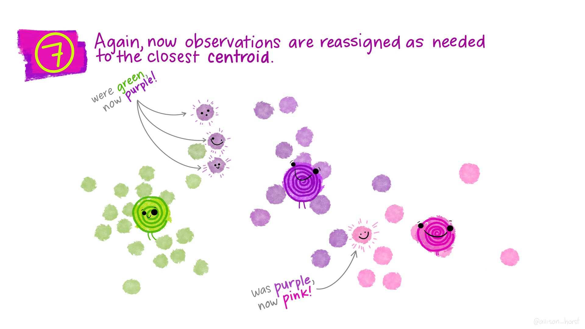 --- 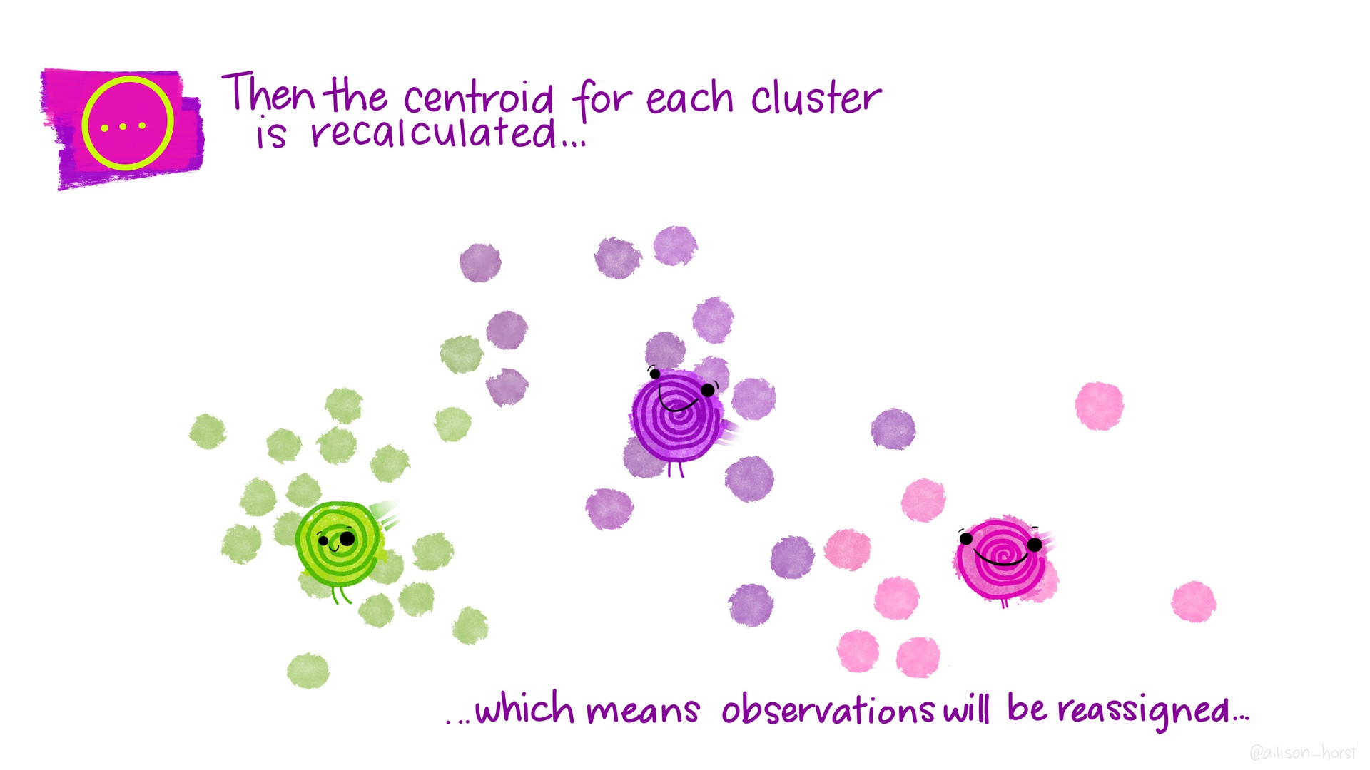 --- 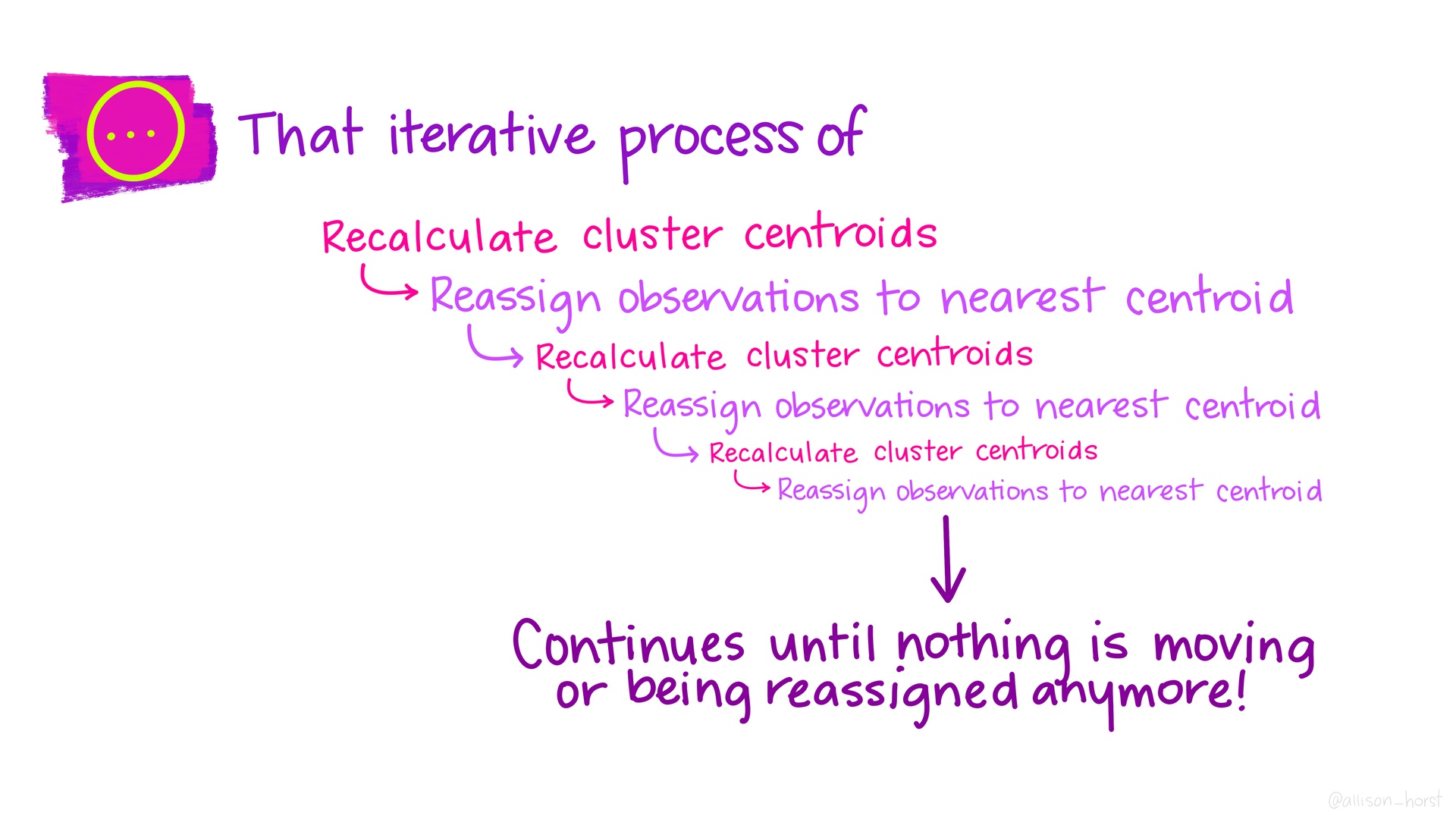 --- 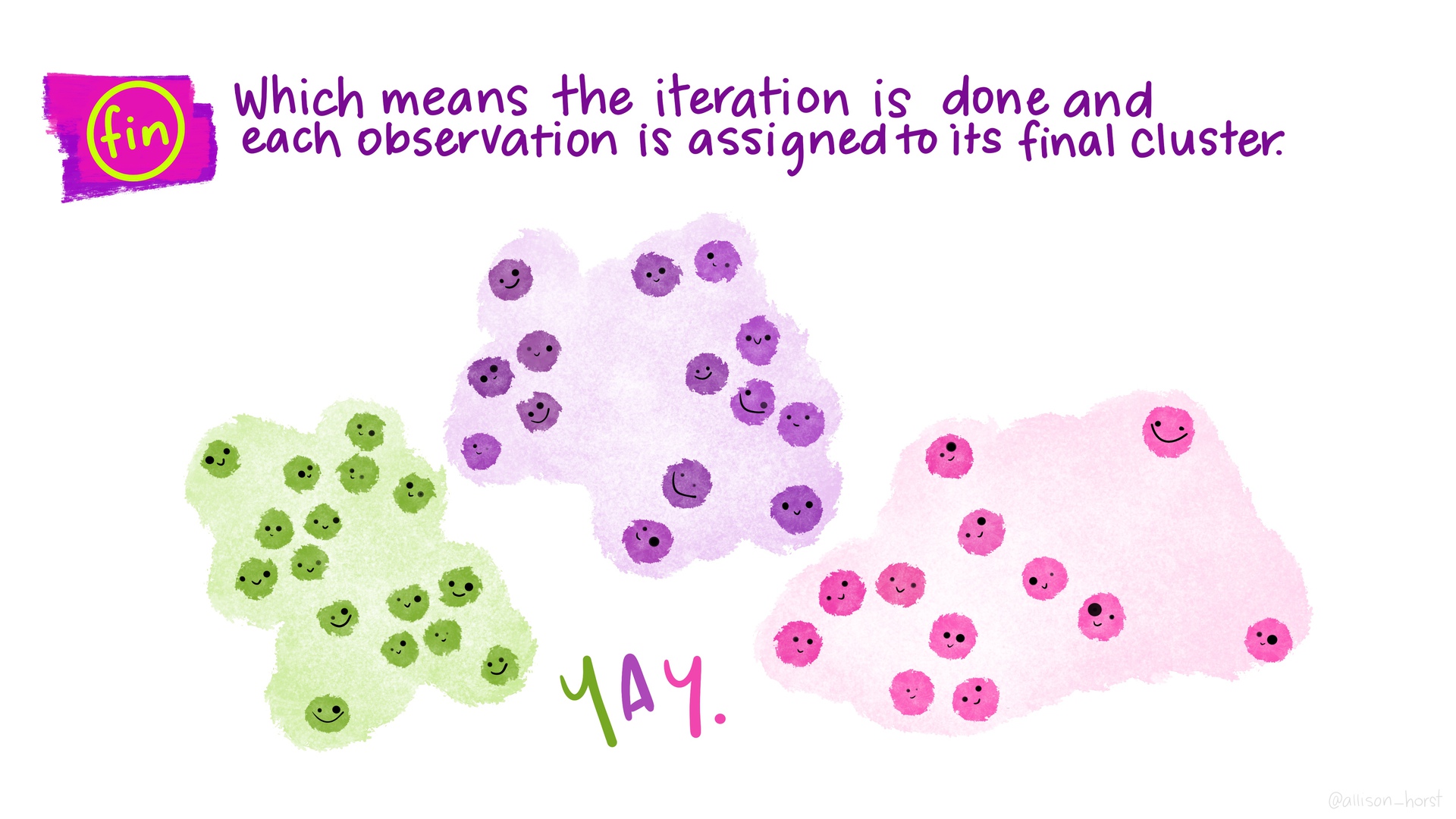 --- ## *Many* types of clustering algorithms  .floating-source[Source: [sklearn documentation](https://scikit-learn.org/stable/modules/clustering.html)] --- ```r set.seed(20201120) clustering_results <- recipe( ~ Latitude + Longitude + Gr_Liv_Area, data = ames_all) %>% step_range(Gr_Liv_Area, min = 0, max = 1) %>% step_range(Latitude, min = 0, max = 1) %>% prep() %>% bake(new_data = ames_all) %>% kmeans(nstart = 4, centers = 3) ames_with_clusters <- ames_all %>% mutate(.cluster = as.factor(clustering_results$cluster)) ``` ```r glance(clustering_results) ``` ``` ## # A tibble: 1 x 4 ## totss tot.withinss betweenss iter ## <dbl> <dbl> <dbl> <int> ## 1 180. 65.5 114. 4 ``` ```r tidy(clustering_results) ``` ``` ## # A tibble: 3 x 6 ## Latitude Longitude Gr_Liv_Area size withinss cluster ## <dbl> <dbl> <dbl> <int> <dbl> <fct> ## 1 0.579 -93.6 0.268 1161 23.8 1 ## 2 0.264 -93.6 0.362 449 18.2 2 ## 3 0.862 -93.6 0.395 802 23.5 3 ``` --- .small-code[ ```r latlong_plot <- ggplot(ames_with_clusters, aes(x = Latitude, y = Longitude, color = .cluster)) + geom_point(alpha = .5) year_area_plot <- ggplot(ames_with_clusters, aes(x = Gr_Liv_Area, y = Year_Built, color = .cluster)) + geom_point(alpha = .5) latlong_plot + year_area_plot + plot_layout(guides='collect') ``` <img src="w12d3-clustering_files/figure-html/cluster-plots-1.png" width="100%" style="display: block; margin: auto;" /> ] --- ## Activities .comfortable[.two-column[ 1. What differences do you notice between the plot on the left and the plot on the right? 1. Try increasing the number of `centers`. What changes about both plots? 2. Try changing the formula to `~ Year_Built` (removing latitude and longitude). What can you say about the age of homes in different parts of town? 2. Try adding `Gr_Liv_Area` to the recipe's formula (`Latitude + Longitude + Gr_Liv_Area`). What changes about both plots? Why are they different? 2. Try adding `step_range(Gr_Liv_Area, min = 0, max = 1)` to the recipe construction pipeline. What changes about both plots? Why? 2. Try adding a `step_range` for `Latitude` (but not `Longitude`). What changes and why? 2. Now add a `step_range` for `Longitude`. What changes and why? 2. Try changing `max` to `10` for `Gr_Liv_Area`. Then try `max = 0.1`. What changes and why? 2. Try adding `Year_Built`. ]] --- Do the patterns captured by these clusters also happen to relate to sale price? ```r ames_with_clusters %>% ggplot(aes(x = Sale_Price, y = .cluster)) + geom_boxplot() ``` <img src="w12d3-clustering_files/figure-html/sale-price-by-cluster-1.png" width="100%" style="display: block; margin: auto;" /> --- ## Appendix ```r library(tidymodels) library(patchwork) ``` ```r #data(ames, package = "modeldata") ames <- AmesHousing::make_ames() ames_all <- ames %>% filter(Gr_Liv_Area < 4000, Sale_Condition == "Normal") %>% mutate(across(where(is.integer), as.double)) %>% mutate(Sale_Price = Sale_Price / 1000) rm(ames) ```