This lab bundles a number of CSS-related tools for Web design.
Using Flexible Boxes
CSS3 FlexBoxes can be use to implement responsive design.
Exercise 5.1 

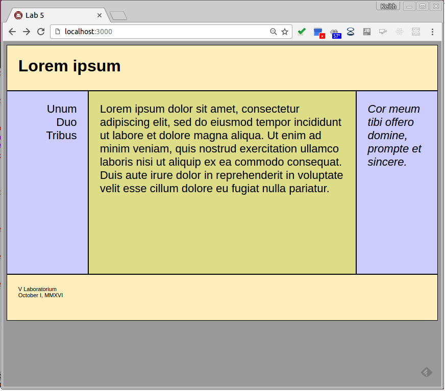
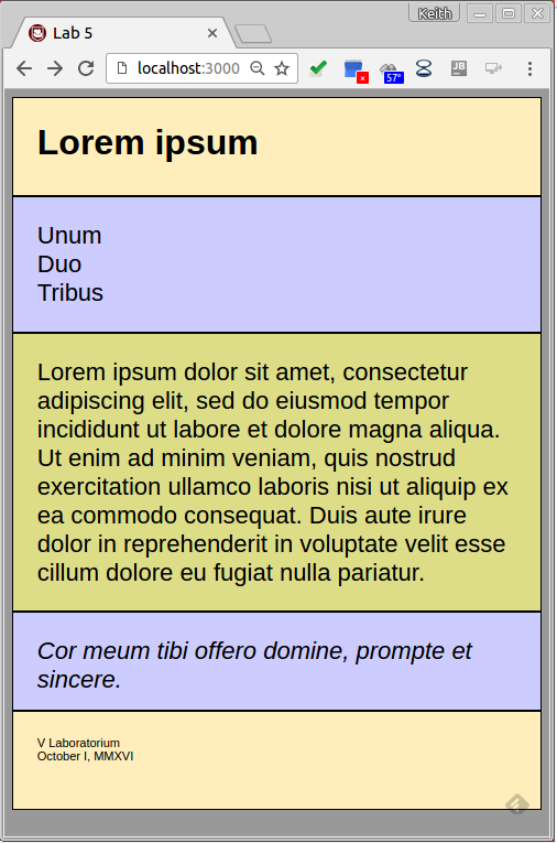
Implement a responsive webpage similar to the one shown on the right
using the code found in
this tutorial: Using CSS Flexible
Boxes*. The responsive styles in
the example occur automatically as the browser frame is resized.
Implement the following
changes to the original example.
- There’s some text added to each nav box.
- The div boxes are squared off, there is no space between them but
some space added
inside them.
- The borders are crafted to look decent.
- The navigation links are right aligned on the desktop and left
aligned on mobile.
- The fonts vary appropriately between the div boxes.
- This can’t be seen in the examples, but the CSS specifications
are stored in a
separate style file.
- The nav section comes before the article in the mobile version.
Feel free to experiment with the responsive layout. When you’ve got
things running,
consider the following questions.
- Be clear on how responsive design relates to CSS3 flexboxes.
- What are the relative advantages and disadvantages of using Flexbox
as opposed to other
related tools, e.g,. HTML tables, Bootstrap and Foundation?
Save the resulting files for the next exercise.
Using Stylus
Stylus is a CSS pre-processor based on Node.js (see Stylus-lang.com).
Exercise 5.2
Use Stylus to refactor the previous example, without changing the content
or style of the
original.
Rename the style.css script to
style.styl. This will now
serve as the input to the Stylus CSS pre-processor.
Use Stylus to pre-compile this file into the expected style.css
as
follows.
stylus pathToFiles/style.styl
                --out
                pathToFiles/.
Now, view the main HTML file in a browser to ensure that nothing
has changed.
Modify the .styl source file in the following ways in order to
achieve DRY goals. Base
your work on the instructions given at Sylus-lang.com under the following
headings:
- Selectors — Remove the CSS punctuation,
including the semi-colons
and the braces. You can decide for yourself whether to
remove the colons as
well.
- Variables — Add variables as appropriate.
- Nesting — Use nesting as appropriate. (N.b.
Nesting doesn’t
have its own section on the Stylus site but is demonstrated
on the second page
of the “Try Stylus Online”
section.)
- Comments — Add some useful comments.
Feel free to experiment with other Stylus features.
Mixins and
functions are particularly useful and the nib library adds CSS3 features.
- Add the
--watch and the --compress
options to the
Stylus command.
When you have these changes made and have ensured that the content and
style have remained
unchanged, consider the following questions.
- Do you need to run your own web server for these changes to work?
Why or why not?
- Is Stylus a valuable tool? If so, under what circumstances? If not,
why not?
- What do the
--watch and the
--compress options do and
why would you want to use them?
Save the updated files for submission. Save your answers to these
questions in a lab05.txt file in the root of your lab repo.
Checking in
We will grade your work according to the following criteria:
- 50% — Responsive page with Flexbox
- 50% — the Stylus specifications
*MDN replaced their original tutorial
(archived here by the Wayback Machine) with this new version. The new
and old versions are similar in content, but the new one no longer
discusses the header-body-footer example used in this lab.

